Seattle will soon have a new public sculpture by Ginny Ruffner outside of the Sheraton Hotel in downtown. The Seattle Times profiles the artist's recent accomplishments.
Gayle Clemans October 2010:
"...Ruffner is clearly on a high right now. A big public sculpture for the corner of Seventh Avenue and Union Street in downtown Seattle is in the final stages of production. An award-winning documentary, "Ginny Ruffner: A Not So Still Life," is currently being screened at film festivals and arts venues. And a big exhibition of recent work has just opened at the Bellevue Arts Museum...Although friends and supporters say the attention she is receiving is well-deserved, Ruffner is not sure why the sudden flurry.
...The technical complexity of her work is obvious in the exhibition at BAM, where five new works of art have been added to the exhibition originally organized by the Museum of Northwest Art in La Conner. There's also a huge sculpture newly installed in BAM's lobby, a graceful aluminum double helix that extends from the ceiling of the grand lobby all the way down to the floor, where it meets a bed of glass flowers.
A self-described "closet geek" who reads science journals for pleasure, Ruffner has been inspired for the last four years by "the recent extraordinary bloom in genetic engineering, particularly plant and animal engineering. That's extremely evocative in terms of what other things could happen, with inter-kingdom, interspecies implications. Does that mean we could share genes with birds?"
The sculptures she has created in this series are hybrids of glass and metal, two and three-dimensions, animal and plant forms, visual and musical references. She considers them "thought experiments," but they are rooted in visual, formal techniques.
...While delighting in the events unfolding at BAM, Ruffner is also overseeing the final production of her public sculpture, "Urban Garden," to be unveiled in early 2011. The Sheraton hotel, sponsor of the project, wanted a water feature. Ruffner wanted to give downtown a garden. The result? A large steel flowerpot with giant flowers that will open and close after being watered by a giant watering can."
Clemans, G. "Ginny Ruffner's art blooms at Bellevue Arts Museum and on film." The Seattle Times. October 22, 2010. Accessed October 31, 2010. http://seattletimes.nwsource.com/html/thearts/2013214662_ruffner24.html?cmpid=2628
Showing posts with label ginny ruffner. Show all posts
Showing posts with label ginny ruffner. Show all posts
Sunday, October 31, 2010


Friday, June 4, 2010
Resonances in Glass @ MoNA (review)

Photo Credit: ABJ
The Museum of Northwest Art is in La Conner, Washington. The lamp-worked glass show currently on is a continuation of the entire museum's theme right now, "Resonances: Contemporary Echoes Modern," in which a modern artist was paired with a contemporary inspired by their work. What makes the glass show featuring three contemporary artists, Ginny Ruffner, Masami Koda, and James Minson, in Benaroya Glass Gallery a part of the overall theme? Kathleen Moles, Curator of Exhibitions, says in her notes to the show that Minson and Koda "both remember being struck in particular by Ginny's work" when it was featured at Tama Art University in Tokyo in 1988 where they were students. As such, her work from the 1980s and 90s is shown in the middle of the room between Minson, whose displayed pieces are dated 2007, and Koda, whose pieces are from 2009.With the exception of Koda's work on loan from Traver Gallery, most of the show is owned by Anne Gould Hauberg. "The Queen of Everything" glass-jeweled crown which Ruffner made for the founder of Pilchuck is shown. It's restrained, a child coloring within the lines. It's different from "The Juggler of my Heart in Person" or "Balance Series: A Balanced Diet." In these, her exploding crayola box of harlequin, checkered, and gilded symbols (cats, hearts, bones, tropical fish, wings) may have inspired Koda and Minson, but these two younger artists have what can only be described as a cooler contemporary feel compared to Ruffner's warm and open work. Alki vs. Freemont. Or, it's as if a way-out-there mom who baked pot brownies raised two children and they rebelled by being part of the mainstream.
Minson is pulled in two directions. On one hand there are the very literal underwater scenes of anemone and coral, and on the other, the abstract 22 panels of black wood crawling with clear squiggles and the perfectly arranged green, orange and white mobile. The mobile made of glass rods is amazing and well-balanced.
Koda's "Still Life" (2009) is the best piece in the show. Though it doesn't employ her beautiful silver and glass bead/berry technique found on "Red Dew 6" and "Spring Blow," and it does have the delicate cage look of a lot of lamp-worked pieces now, it contains the most perfect squared-off taper at the top of the bell-jar. You'll can view it on Traver's website.
I would have taken a picture, but there were no photos allowed. (I did draw it, but my sketch is ugly. There was a fascinating article somewhere recently about photography permission in museums, I'll try and find it.) So here are a few photos of other things in and around La Conner instead. La Conner is fun, the museum is only $2 for students $5 for adults, and Clayton Beach is not far away (from Seattle)...it's worth the trip.

Photo Credit: ABJ
Ries Niemi's Fish Bridge, the artist who once said "Glass art makes me wish for earthquakes."
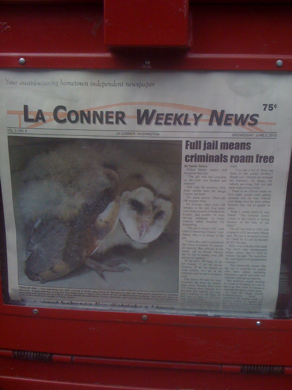
Photo Credit: ABJ
La Conner Weekly News: "Full Jail Means Criminals (like this bad bad baby owl) Roam Free."
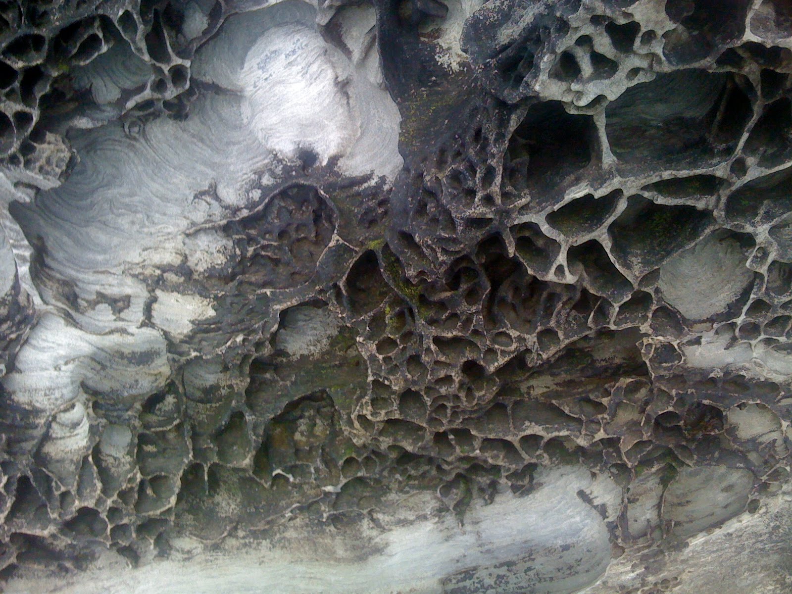
Photo Credit: ABJ
close up of a Sandstone Boulder, Clayton Beach
Wednesday, August 12, 2009
2008 Stanford University Show
2008 Ben Marks:
"This summer, with little fanfare, the Cantor Arts Center at Stanford University borrowed fewer than 20 rather superb works of Contemporary Glass from local collections and put on a show. The reason for this modest endeavor was not to respond to the gargantuan scale of Chihuly at the de Young. Rather, it was to call attention to the connection between Stanford University and the Venetian glass firm of Salviati & Co., whose mosaic murals grace Stanford Memorial Church. Jane Stanford herself gave the Salviati company the commission, for which the Salviati company gave Mrs. Stanford some 200 glass vessels as a thank-you gift.
"This summer, with little fanfare, the Cantor Arts Center at Stanford University borrowed fewer than 20 rather superb works of Contemporary Glass from local collections and put on a show. The reason for this modest endeavor was not to respond to the gargantuan scale of Chihuly at the de Young. Rather, it was to call attention to the connection between Stanford University and the Venetian glass firm of Salviati & Co., whose mosaic murals grace Stanford Memorial Church. Jane Stanford herself gave the Salviati company the commission, for which the Salviati company gave Mrs. Stanford some 200 glass vessels as a thank-you gift.
As conceits go, this one's predictably precious, but Stanford is not the only august institution of higher learning to be somewhat taken with itself, so it's in good company. More interesting than the self-congratulatory reason for the show is the art and, like it or not, how this exhibition compares to the three-ring circus to the north.
The pieces in Contemporary Glass are displayed in the circular Oshman Family Rotunda (the balcony overlooking the Rodin sculptures) and the long H. L. Kwee Galleria (the second-floor passageway adjacent to the main galleries of contemporary art). The show begins at the nexus of both spaces with a hand-painted, lampworked piece from 1995 by Ginny Ruffner. Like many of Ruffner's sculptures, this one, called Double Dutch, is built on an open armature of glass, which, in this case, resembles a six-sided diamond pointing up. Attached wherever it seems convenient and aesthetically sensible is a heart, fish hook, picture frame, flower, and pair of frontward and backward capital Ds, whose voids have been filled in with almost naive copies of the couple in the famous Jan van Eyck painting from 1434 called The Arnolfi Portrait. Never mind that van Eyck was not Dutch; Ruffner is more interested in poetry than precision. The surface of Ruffner's work is the thing that continues to get me. I just love the way her colors alternately hide or accentuate the sand-pitted surface of her fragile, occasionally unwieldy, forms.
Just down the hall is a lovely piece by Richard Royal, who spent a couple of decades (or maybe it just felt like that) as a gaffer on various Chihuly teams. Part of the Relationship Series, this 1992 work consists of a pair of bowls, one a soft blue, the other an equally quiet green, whose bases, if you can imagine this, are shaped like snaking tails or tendrils. The tails face each other so that one bowl rests on its rim while the other is open at the top. In the middle, simultaneously being caressed by and holding these two mirror images together, is a traditionally shaped purple vase, suspended in space by the embrace of the green and blue tendrils. Like much of Royal's work, this deceptively simple piece does not call undue attention to itself. Certainly there are countless more fantastic examples of these sorts of snaking shapes, in a shamelessly varied range of colors, up at the de Young, but Royal is not going for volume here. For him, it's quite enough, thank you, to do one thing with modest perfection.
Toward the end of the hall is one of two works in the show by Richard Marquis. This one is a teapot from 1977, which was selected, no doubt, because of Marquis's use of murrine, which are slender threads of glass that have been collected and then fused to reveal patterns or designs when they are cut into cross sections (picture sushi, with white glass for the rice, purple glass for the tuna, green for the cucumber, etc.) Marquis's murrine designs lean to hearts, stars, and checkerboards, which he applies to his vessels when they are still hot. As the vessel expands and is deliberately distorted, the murrine become blurry and irregularly shaped, all of which gives the teapot the look of something you might find in the kitchen cupboard of one of the Freak Brothers.
Other pieces to spend some time with include Yellow and Ferrari Red Palla by Benjamin Moore, who has also done his time working for Chihuly, and two untitled forms by Lino Tagliapietra, the Venetian master who taught a number of the artists here more than a few of the most important secrets of the Venetian glass trade. Tagliapietra's pieces, both from 1997, have a mid-century-modern sensibility that's unique in this group. The pink and blue colors are deliberately dull while the shapes (the blue one is weirdly tall while the pink lozenge-shaped piece feels vaguely feminine) are just plain odd. The vertical black pinstriping on the surfaces of the pieces completes their retro feel, but it's the surface beneath the surface of these curious objects that catches you by surprise. Using a technique called battuto, Tagliapietra has carved lines resembling the marks for a woodcut into small sections of his pieces. The rest of the surface below the pinstriping has been painstakingly chipped away to give the objects the look of a pair ancient hammered copper urns.
The Chihulys in the Rotunda are handsome enough, although by now we have been well trained by the artist to expect a great deal more, as is the Petroglyph Vessel from 1990 by William Morris (another Chihuly factory alum). But the objects you are most likely to fall in love with are the bowls from 1995 and 2006 by Mary Ann (Toots) Zynsky. Unlike Ruffner, who paints in a fairly traditional manner on her surfaces, Zynsky's pieces are all paint, built entirely from the wire-like threads of pure colored glass that Marquis and others use to create murrine. Instead of forming her threads into rods that are meant to be sliced, heated, and then expanded, Zynsky works with the threads themselves, painting in three dimensions with their colors and then slumping and fusing her compositions into organic, bowl- or basket-like shapes. Resembling nests created by a bird with a highly developed sense of color and a serious case of obsessive-compulsive disorder, Zynsky's work remains singular amid the gloss of much contemporary glass. Her pieces don't shine, but oh how they glow.
Contemporary Glass runs indefinitely at Cantor Arts Center, Lomita Drive and Museum Way, Stanford. Admission is free; closed Mondays and Tuesdays. For information visit museum.stanford.edu or call 650-723-4177."
Marks, B. "Contemporary glass at Stanford." August 31, 2008. accessed August 12, 2009 http://www.kqed.org/arts/visualarts/article.jsp?essid=23258. KQED, Northern California Public Broadcasting.
Monday, March 30, 2009
1991
In this time line I pull quotes to illustrate a thread in popular and scholarly writing and criticism about glass. Here we will see current glass artists defending their art against the accusations and separating themselves from these stereotypes and, hopefully, find out how and where the now-common opinion was born. Fundamentally, the general thesis seems to be born of the question, What Is Art? This question I will leave to others to answer, here I am only documenting the written history of a popular way of thinking and a popular taste.
1991 Ginny Ruffner:
"Currently the field of “glass art” is awash in objects, many beautiful, some ugly, most about glass itself–material as content. But if this medium-specific subgroup is to progress beyond a fascination with the materials, the evocative contradictions of glass have to be pursued more aggressively, manifested more succinctly. There have been many superficial depictions of beauty but few examinations of the meanings of beauty though a material that so successfully conveys it."
Ginny Ruffner, 1991, Tacoma Museum of Art, "Glass: Material in the Service of Meaning."
1991 Ginny Ruffner:
"Currently the field of “glass art” is awash in objects, many beautiful, some ugly, most about glass itself–material as content. But if this medium-specific subgroup is to progress beyond a fascination with the materials, the evocative contradictions of glass have to be pursued more aggressively, manifested more succinctly. There have been many superficial depictions of beauty but few examinations of the meanings of beauty though a material that so successfully conveys it."
Ginny Ruffner, 1991, Tacoma Museum of Art, "Glass: Material in the Service of Meaning."
Wednesday, March 18, 2009
Is it Post-craft or simply Not-craft?
It seems like the term post-craft was cultivated to show that glass art really is “in the service of meaning”, as Ginny Ruffner put it. This new terminology states that glass art is art and not simply beautiful science. That glass art contributes to our growing awareness as human beings. That glass art is not business centered; it will doff its need to sell itself (to make money) and simply find it’s artistic way by exploring the concepts of life like every other artist does.
Mark Lyman (of SOFA) said in 2007…"the main evolution seems to be a further embrace of the abstract and sculptural over the functional, increasingly sophisticated intellectual content, and experimentation with new materials.” (Blue Manifesto Blog Accessed September 2008)
If the post-craft glass is an evolution of glass art away from the Crafts aspect of Arts and Crafts, then why not just call it Arts? That is what they're trying to prove with this after all!
Does "Post-craft" work as a label? Should it really be called Not-craft?
Enough with the pre-fix "post"! Post-modern, post-apocalyptic, post-coital, post-classical...post-rock. Please read "Musical terms that you irrationally hate"
Question: Why, in a social historical context, have SOFA (Sculpture, Objects, Functional Art) vendors chosen to hype works that favor intellect over function in 2007?
Answer: Their choices could be a conscious decision to show works that might move glass closer to acceptance in the art world. Enough glass artists and critics wondered about glass’s viability as art, and they is responding by selecting works to display that meet the criteria of so-called meaningful art. This came at the expense of utilitarian objects because some people could not find deeper meaning in useful items.
Answer: Their choices could be a conscious decision to show works that might move glass closer to acceptance in the art world. Enough glass artists and critics wondered about glass’s viability as art, and they is responding by selecting works to display that meet the criteria of so-called meaningful art. This came at the expense of utilitarian objects because some people could not find deeper meaning in useful items.
Mark Lyman (of SOFA) said in 2007…"the main evolution seems to be a further embrace of the abstract and sculptural over the functional, increasingly sophisticated intellectual content, and experimentation with new materials.” (Blue Manifesto Blog Accessed September 2008)
If the post-craft glass is an evolution of glass art away from the Crafts aspect of Arts and Crafts, then why not just call it Arts? That is what they're trying to prove with this after all!
Does "Post-craft" work as a label? Should it really be called Not-craft?
Enough with the pre-fix "post"! Post-modern, post-apocalyptic, post-coital, post-classical...post-rock. Please read "Musical terms that you irrationally hate"
So...what are you saying? I'm dumb? Or I'm narcissistic?
 So shallow.
“We are, however, at a critical juncture in glass history, a juncture identified with a climate of new ideas about glass and its place in the larger continuum of art…
Traditionally, the rule of art in the Western world has been to reveal and interpret the non art experience. Currently, the central artistic issues in glass are shifting from such concerns as how an object is made and perceived, or what defines its style, to considerations of why art is made and experienced, and what a work of art means or signifies beyond the experience of its formal, stylistic, and material ingredients.
Currently the field of “glass art” is awash in objects, many beautiful, some ugly, most about glass itself–material as content. But if this medium-specific subgroup is to progress beyond a fascination with the materials, the evocative contradictions of glass have to be pursued more aggressively, manifested more succinctly. There have been many superficial depictions of beauty but few examinations of the meanings of beauty though a material that so successfully conveys it.
I am not pessimistic…glass will continue to be a material in the service of meaning.”
-Ginny Ruffner, 1991, Tacoma Museum of Art, "Glass: Material in the Service of Meaning."
In the 90s and early 2000s, before the term Post-Craft appeared along with it's emphasis on abstract sculpture over traditional shapes, it seemed glass artists were worried that their art was not taken seriously by art critics and that glass artists were not receiving the attention or respect due to them by contemporary art collectors.
Ginny Ruffner, in the passage above written for the Tacoma Museum of Art, suggested this could be because of a lack of intellectual depth and a preoccupation with the physical materials of the glass itself. Glass was pretty to look at, but for it to have time-withstanding worth in the art world, she believed that it had to convey an idea or examine the meaning of something, even the beauty of itself could be in question.
It seems that recently glassblowers have taken Ruffner and her sentiment up on the challenge, insofar as they've moved away from vessel shapes towards different shapes and adopted other surface finishes that don't have the polished gloss which critics saw as glass's vanity.
Which 1980s pieces do you think she was referring to as superficial?
Subscribe to:
Posts (Atom)


